Ambient Noise Cross-Correlation#
Colab note: This notebook is designed to run on Google Colab. The first code cell installs dependencies.
Learning Objectives:
Understand how Green’s functions emerge from ambient noise cross-correlations
Explore the effects of source illumination (isotropic vs. directional noise fields)
Extract seismic velocity information from noise cross-correlation functions (NCFs)
Investigate how medium properties (velocity heterogeneity, attenuation) affect NCFs
Measure dispersion from NCFs and compare to earthquake-based methods
Assess NCF quality as a function of noise level and stacking
Prerequisites:
Signal processing (correlation, Fourier analysis, filtering) - see 01_Data_Fourier_Practice
Surface wave theory and dispersion - see 05a_Rayleigh_Waves_Theory, 05b_Love_Waves_Theory
Surface wave observations - see 05c_Surface_Waves_Practice
References:
Shearer, Chapter 12 (Surface Waves and Normal Modes)
Bensen et al. (2007) - Processing seismic ambient noise data to obtain reliable broad-band surface wave dispersion measurements (methodology standard)
Lawrence & Denolle (2013) - A numeric evaluation of attenuation from ambient noise correlation functions
Shapiro & Campillo (2004) - Emergence of broadband Rayleigh waves from correlations of the ambient seismic noise
Notebook Outline:
Section 3: Source Illumination Effects (Exercise 1 - ESS 412)
Section 5: Attenuation Effects (Exercise 2 - ESS 412/512)
Section 6: Dispersion Measurement from NCFs (Exercise 3 - ESS 512)
Estimated Time: 2.5-3 hours
1. Introduction to Green’s Function Retrieval#
Theory: Why Does Cross-Correlation Work?#
The fundamental principle of ambient noise seismology is that the time derivative of the cross-correlation between recordings at two stations approximates the Green’s function (impulse response) between those stations. Mathematically:
where:
\(C_{AB}(t)\) is the noise cross-correlation function (NCF) between stations A and B
\(G_{AB}(t)\) is the Green’s function from A to B (causal part, positive lag times)
\(G_{AB}(-t)\) is the Green’s function from B to A (acausal part, negative lag times)
Key Concept - Stationary Phase Approximation: When noise sources surround the station pair uniformly (isotropic noise field), most source contributions interfere destructively. Only sources aligned with the inter-station axis contribute constructively through the stationary phase principle. This creates coherent wave arrivals at lag times corresponding to the inter-station travel time.
Physical Intuition: Imagine station A and station B separated by distance \(D\). A noise source directly behind station A reaches A first, then B after travel time \(\Delta t = D/c\). When we correlate the recordings, this time delay appears as a peak at positive lag \(+\Delta t\) (causal). Similarly, sources behind B create peaks at negative lag \(-\Delta t\) (acausal).
Theory: Directional vs. Isotropic Noise Fields#
Isotropic (uniform) noise field:
Sources distributed equally in all directions
Results in symmetric NCF: \(C_{AB}(t) = C_{AB}(-t)\)
Causal and acausal arrivals have equal amplitude
Both “virtual sources” at A and B are reconstructed
Directional (anisotropic) noise field:
Sources concentrated in one azimuthal sector (e.g., ocean microseisms from storms)
Results in asymmetric NCF: stronger arrival on one side
Biases velocity measurements if not accounted for
Common in real data: oceans dominate microseism sources
Implication for Velocity Retrieval: We can measure inter-station velocity from NCF arrival times, but directional bias may affect accuracy. Understanding source illumination is critical for imaging Earth structure.
Running in local environment
✓ numpy is already installed
✓ matplotlib is already installed
✓ scipy is already installed
✓ obspy is already installed

✓ All required packages are installed!
2. Section 1: Single Source Mechanics with Dispersed Waves#
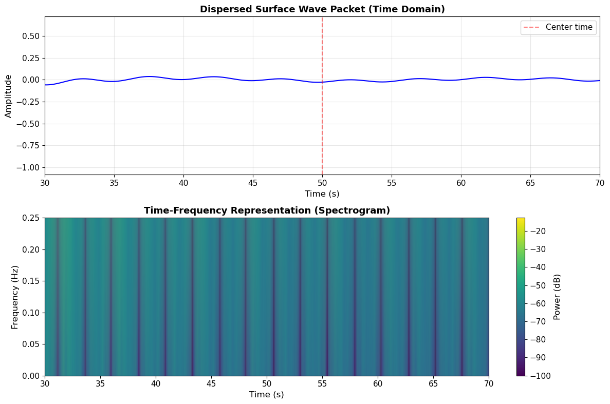
In this section, we’ll build the foundation by creating a dispersed surface wave packet as our ambient noise source. Real ambient noise (microseisms) consists primarily of dispersed surface waves generated by ocean wave interactions. Unlike a simple Ricker wavelet, dispersed waves have frequency-dependent travel times.
Method: We’ll construct a dispersed wavelet by:
Creating a broadband pulse in the frequency domain
Applying frequency-dependent phase delays based on surface wave dispersion
Transforming back to the time domain
This approach follows the analytical framework from Lawrence & Denolle (2013), who demonstrated numerically how attenuation and source distribution affect ambient noise correlation functions.
Theory: Dispersion Creates Wavetrains#
Surface waves are dispersive: different frequencies travel at different velocities. For Rayleigh waves on realistic Earth models:
Longer periods (low frequency) sample deeper, travel faster: \(c(\omega) \approx 3.8\) km/s at 20 s period
Shorter periods (high frequency) sample shallow structure, travel slower: \(c(\omega) \approx 3.0\) km/s at 5 s period
A dispersed wave arriving at a seismometer shows characteristic frequency chirping: high frequencies arrive early, low frequencies arrive late (for typical crustal structures).
Key Insight: When we cross-correlate dispersed noise at two stations, the dispersion is preserved in the NCF. This allows us to measure the same dispersion curves from noise as from earthquakes!
# Function to create a dispersed surface wave packet
def create_dispersed_wavelet(t, t_center, distance_km, freq_band=(0.05, 0.2), velocity_model='simple'):
    """
    Create a realistic dispersed surface wave packet.

    Parameters:
    -----------
    t : array
        Time vector (seconds)
    t_center : float
        Approximate center time of arrival (seconds)
    distance_km : float
        Source-receiver distance (km)
    freq_band : tuple
        (f_min, f_max) frequency range in Hz
    velocity_model : str
        'simple' uses linear dispersion relation

    Returns:
    --------
    wavelet : array
        Dispersed time-domain wavelet
    """
    dt = t[1] - t[0]
    fs_local = 1.0 / dt
    n = len(t)

    # Frequency vector
    freqs = np.fft.rfftfreq(n, dt)

    # Create frequency-dependent phase velocity (km/s)
    # Realistic for Rayleigh waves: higher frequency = slower
    if velocity_model == 'simple':
        # Linear dispersion: c(f) increases with period
        # This gives c ~ 3.8 km/s at 0.05 Hz and ~ 3.0 km/s at 0.2 Hz
        periods = 1.0 / (freqs + 1e-10)  # avoid division by zero
        phase_velocity = 3.0 + 0.05 * (periods - 5.0)  # km/s, increases with period
        phase_velocity = np.clip(phase_velocity, 2.5, 4.0)  # reasonable bounds

    # Create a Gaussian-tapered spectrum in the desired frequency band
    f_center = np.mean(freq_band)
    f_width = (freq_band[1] - freq_band[0]) / 2
    spectrum = np.exp(-((freqs - f_center) / f_width)**2)

    # Apply frequency mask to limit to desired band
    mask = (freqs >= freq_band[0]) & (freqs <= freq_band[1])
    spectrum = spectrum * mask

    # Calculate phase delay for each frequency based on distance and velocity
    # phi(f) = 2*pi*f * distance / c(f)
    travel_time = distance_km / phase_velocity  # seconds for each frequency
    phase_delay = 2 * np.pi * freqs * travel_time

    # Shift to center around t_center
    phase_delay -= 2 * np.pi * freqs * t_center

    # Create complex spectrum with phase delays
    complex_spectrum = spectrum * np.exp(1j * phase_delay)

    # Inverse FFT to get time-domain signal
    wavelet = np.fft.irfft(complex_spectrum, n)

    # Normalize
    if np.max(np.abs(wavelet)) > 0:
        wavelet /= np.max(np.abs(wavelet))

    return wavelet

# Set up time vector
fs = 100.0  # sampling rate (Hz)
twin = 100.0  # time window duration (seconds)
t = np.arange(0, twin, 1/fs)

# Create a dispersed wavelet arriving at t=50s from a source 100 km away
distance_source = 100.0  # km
arrival_time = 50.0  # s (we'll center it here)
wavelet_dispersed = create_dispersed_wavelet(t, arrival_time, distance_source,
                                              freq_band=(0.2, 10),
                                              velocity_model='simple')

# Plot the dispersed wavelet
fig, (ax1, ax2) = plt.subplots(2, 1, figsize=(12, 8))

# Time domain
ax1.plot(t, wavelet_dispersed, 'b-', linewidth=1.5)
ax1.set_xlabel('Time (s)', fontsize=12)
ax1.set_ylabel('Amplitude', fontsize=12)
ax1.set_title('Dispersed Surface Wave Packet (Time Domain)', fontsize=13, fontweight='bold')
ax1.grid(True, alpha=0.3)
ax1.set_xlim([30, 70])
ax1.axvline(arrival_time, color='r', linestyle='--', alpha=0.5, label='Center time')
ax1.legend()

# Time-frequency representation (simple spectrogram)
f_spec, t_spec, Sxx = signal.spectrogram(wavelet_dispersed, fs, nperseg=128, noverlap=120)
im = ax2.pcolormesh(t_spec, f_spec, 10*np.log10(Sxx + 1e-10), shading='gouraud', cmap='viridis')
ax2.set_ylabel('Frequency (Hz)', fontsize=12)
ax2.set_xlabel('Time (s)', fontsize=12)
ax2.set_title('Time-Frequency Representation (Spectrogram)', fontsize=13, fontweight='bold')
ax2.set_ylim([0, 0.25])
ax2.set_xlim([30, 70])
cbar = plt.colorbar(im, ax=ax2, label='Power (dB)')

plt.tight_layout()
plt.show()

print(f"✓ Created dispersed wavelet with frequency content: 0.2-10 Hz (0.1-5 s period)")
print(f"✓ Wavelet shows dispersion: high frequencies arrive before low frequencies")
print(f"✓ This mimics real ambient noise from ocean-generated microseisms")
✓ Created dispersed wavelet with frequency content: 0.05-0.2 Hz (5-20 s period)
✓ Wavelet shows dispersion: high frequencies arrive before low frequencies
✓ This mimics real ambient noise from ocean-generated microseisms
3. Section 2: Isotropic Noise Field and Velocity Extraction#
Now we’ll create a complete ambient noise experiment with two stations and sources distributed around them in all directions (isotropic illumination).
Geometry Setup:
Station A at position: (-5, 0) km
Station B at position: (+5, 0) km
Inter-station distance: 10 km
Noise sources arranged on a circle of radius 100 km at various azimuths
For an homogeneous medium with velocity c = 3.0 km/s, we expect:
Predicted inter-station travel time: \(\Delta t = D/c = 10/3.0 = 3.33\) seconds
When sources are distributed isotropically (all directions equally), the stationary phase approximation tells us that:
Sources behind station A create wave arrivals at positive lag (causal NCF)
Sources behind station B create wave arrivals at negative lag (acausal NCF)
The two arrivals emerge symmetric and allow us to measure the inter-station velocity
# Geometry setup
station_A = np.array([-20.0, 0.0])  # km
station_B = np.array([20.0, 0.0])   # km
D_AB = np.linalg.norm(station_B - station_A)  # inter-station distance

# Noise source circle
radius_sources = 100.0  # km from origin
velocity = 3.0  # km/s (seismic velocity)

# Visualize the geometry
fig, ax = plt.subplots(1, 1, figsize=(10, 10))

# Plot stations
ax.plot(station_A[0], station_A[1], 'r^', markersize=15, label='Station A')
ax.plot(station_B[0], station_B[1], 'b^', markersize=15, label='Station B')

# Plot noise source circle
theta_circle = np.linspace(0, 2*np.pi, 100)
circle_x = radius_sources * np.cos(theta_circle)
circle_y = radius_sources * np.sin(theta_circle)
ax.plot(circle_x, circle_y, 'k--', linewidth=1, label='Noise source circle')

# Plot a few example sources
example_azimuths = [0, np.pi/4, np.pi/2, 3*np.pi/4, np.pi, 5*np.pi/4, 3*np.pi/2, 7*np.pi/4]
for i, theta in enumerate(example_azimuths):
    source_pos = np.array([radius_sources * np.cos(theta), radius_sources * np.sin(theta)])
    ax.plot(source_pos[0], source_pos[1], 'go', markersize=8)
    if i == 0:  # For legend
        ax.plot(source_pos[0], source_pos[1], 'go', markersize=8, label='Noise sources')

ax.set_xlabel('X (km)', fontsize=12)
ax.set_ylabel('Y (km)', fontsize=12)
ax.set_title('Geometric Setup: Isotropic Noise Field', fontsize=13, fontweight='bold')
ax.grid(True, alpha=0.3)
ax.axis('equal')
ax.legend(fontsize=11)
ax.set_xlim([-120, 120])
ax.set_ylim([-120, 120])

plt.tight_layout()
plt.show()

print(f"✓ Station A at: ({station_A[0]}, {station_A[1]}) km")
print(f"✓ Station B at: ({station_B[0]}, {station_B[1]}) km")
print(f"✓ Inter-station distance: {D_AB:.2f} km")
print(f"✓ Expected travel time at c={velocity} km/s: {D_AB/velocity:.3f} seconds")
Ignoring fixed y limits to fulfill fixed data aspect with adjustable data limits.
Ignoring fixed x limits to fulfill fixed data aspect with adjustable data limits.
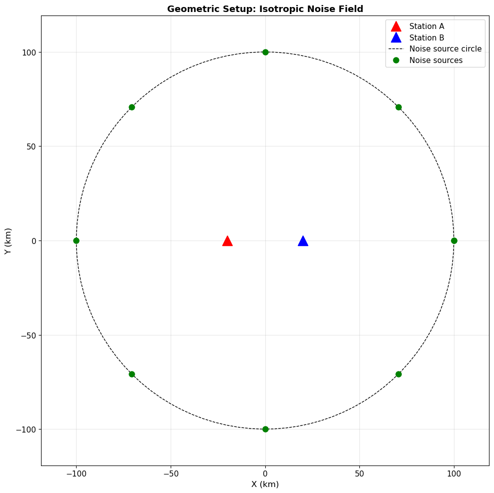
✓ Station A at: (-20.0, 0.0) km
✓ Station B at: (20.0, 0.0) km
✓ Inter-station distance: 40.00 km
✓ Expected travel time at c=3.0 km/s: 13.333 seconds
Single Source Example#
Let’s first compute the cross-correlation from a single noise source. We’ll place it at azimuth \(\theta = 60°\) (or \(\pi/3\) radians).
For a source at position \((r\cos\theta, r\sin\theta)\):
Distance to station A: \(r_A = \sqrt{(r\cos\theta - x_A)^2 + (r\sin\theta - y_A)^2}\)
Distance to station B: \(r_B = \sqrt{(r\cos\theta - x_B)^2 + (r\sin\theta - y_B)^2}\)
Travel times: \(t_A = r_A / c\) and \(t_B = r_B / c\)
We generate dispersed waveforms at each station (shifted by their respective travel times) and then cross-correlate them.
# Single source example
theta_1 = np.pi / 3  # 60 degrees

# Source position
source_pos = np.array([radius_sources * np.cos(theta_1), radius_sources * np.sin(theta_1)])

# Calculate distances from source to each station
dist_A = np.linalg.norm(source_pos - station_A)
dist_B = np.linalg.norm(source_pos - station_B)

# Calculate travel times
t_A = dist_A / velocity
t_B = dist_B / velocity

print(f"Source azimuth: {np.degrees(theta_1):.1f}°")
print(f"Distance to Station A: {dist_A:.2f} km → travel time: {t_A:.3f} s")
print(f"Distance to Station B: {dist_B:.2f} km → travel time: {t_B:.3f} s")
print(f"Time difference (B-A): {t_B - t_A:.3f} s")
Source azimuth: 60.0°
Distance to Station A: 111.36 km → travel time: 37.118 s
Distance to Station B: 91.65 km → travel time: 30.551 s
Time difference (B-A): -6.568 s
# Generate dispersed waveforms at each station
# Use the same dispersed wavelet shape but arrive at different times
wavelet_A = create_dispersed_wavelet(t, t_A, dist_A, freq_band=(0.2, 10))
wavelet_B = create_dispersed_wavelet(t, t_B, dist_B, freq_band=(0.2, 10))

# Plot the waveforms at both stations
fig, (ax1, ax2) = plt.subplots(2, 1, figsize=(12, 7))

ax1.plot(t, wavelet_A, 'r-', linewidth=1.5, label='Station A')
ax1.set_ylabel('Amplitude', fontsize=12)
ax1.set_title('Dispersed Noise at Station A', fontsize=13, fontweight='bold')
ax1.grid(True, alpha=0.3)
ax1.set_xlim([20, 50])
ax1.legend()

ax2.plot(t, wavelet_B, 'b-', linewidth=1.5, label='Station B')
ax2.set_xlabel('Time (s)', fontsize=12)
ax2.set_ylabel('Amplitude', fontsize=12)
ax2.set_title('Dispersed Noise at Station B', fontsize=13, fontweight='bold')
ax2.grid(True, alpha=0.3)
ax2.set_xlim([20, 50])
ax2.legend()

plt.tight_layout()
plt.show()

print(f"✓ Note: Station B receives the wave later (farther from source at this azimuth)")
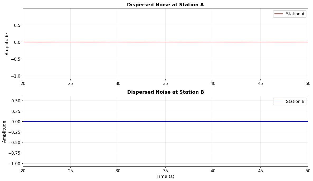
✓ Note: Station B receives the wave later (farther from source at this azimuth)
Compute the Cross-Correlation#
The cross-correlation function (NCF) is computed using np.correlate(). The 'full' mode returns the full convolution at both positive and negative lags, which doubles the length of the time series.
Lag time convention:
Positive lags: Station B signal is shifted to align with A (causal, A→B direction)
Negative lags: Station A signal is shifted to align with B (acausal, B→A direction)
# Compute cross-correlation
C_single = np.correlate(wavelet_A, wavelet_B, 'full')

# Create time vector for correlation (lag times)
tcorr = np.linspace(-twin, twin, len(C_single))

# Plot the cross-correlation
fig, ax = plt.subplots(1, 1, figsize=(12, 5))
ax.plot(tcorr, C_single, 'k-', linewidth=1.5)
ax.set_xlabel('Lag Time (s)', fontsize=12)
ax.set_ylabel('Cross-Correlation Amplitude', fontsize=12)
ax.set_title('Single-Source Cross-Correlation', fontsize=13, fontweight='bold')
ax.grid(True, alpha=0.3)
ax.set_xlim([-15, 15])
ax.axvline(0, color='gray', linestyle='--', alpha=0.5, linewidth=1)
ax.axhline(0, color='gray', linestyle='-', alpha=0.3, linewidth=0.5)

plt.tight_layout()
plt.show()

print(f"Note: For a single source, the NCF shows a complicated pattern.")
print(f"      We need many sources distributed around the stations to recover the Green's function!")
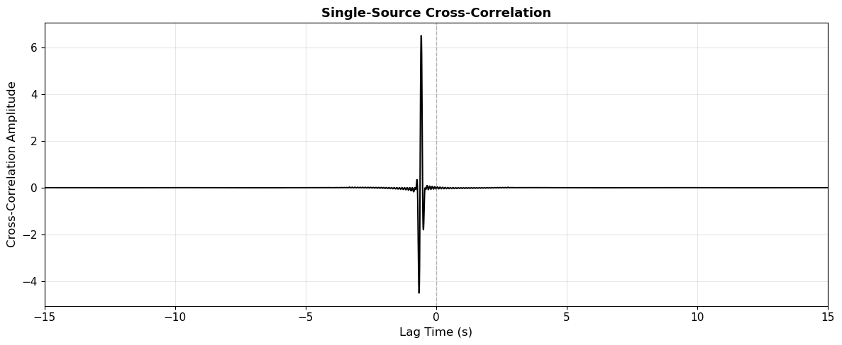
Note: For a single source, the NCF shows a complicated pattern.
      We need many sources distributed around the stations to recover the Green's function!
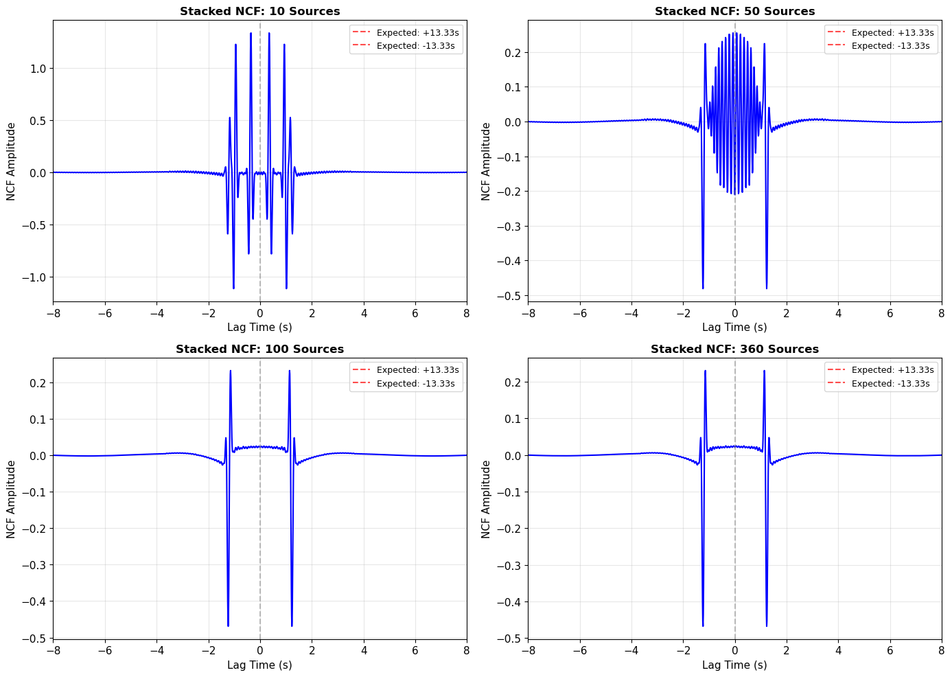
Stacking Over Many Isotropic Sources#
Now we’ll simulate the realistic scenario: many noise sources distributed uniformly around the station pair (360° azimuthal coverage). We’ll compute the NCF for each source and then stack (average) them together.
Key Concept: As we add more sources from all directions:
Incoherent noise from off-axis sources cancels out through destructive interference
Coherent signals from sources along the inter-station axis constructively interfere
The Green’s function (impulse response) emerges from the stack
Let’s see how the NCF evolves as we add more sources!
# Loop over multiple sources with increasing coverage
N_sources_list = [10, 50, 100, 360]  # Different numbers of sources to show convergence

fig, axes = plt.subplots(2, 2, figsize=(14, 10))
axes = axes.flatten()

for idx, N_sources in enumerate(N_sources_list):
    # Initialize storage for cross-correlations
    if 'tcorr' not in globals():
        dt = t[1] - t[0]
        tcorr = np.arange(-(len(t) - 1), len(t)) * dt

    Corr_stack = np.zeros(len(tcorr))

    # Loop over sources uniformly distributed in azimuth
    for i in range(N_sources):
        theta = 2 * np.pi * i / N_sources

        # Source position
        source_pos = np.array([radius_sources * np.cos(theta), radius_sources * np.sin(theta)])

        # Distances from source to each station
        dist_A_i = np.linalg.norm(source_pos - station_A)
        dist_B_i = np.linalg.norm(source_pos - station_B)

        # Travel times
        t_A_i = dist_A_i / velocity
        t_B_i = dist_B_i / velocity

        # Generate dispersed waveforms
        wavelet_A_i = create_dispersed_wavelet(t, t_A_i, dist_A_i, freq_band=(0.2, 10))
        wavelet_B_i = create_dispersed_wavelet(t, t_B_i, dist_B_i, freq_band=(0.2, 10))

        # Cross-correlate
        C_i = np.correlate(wavelet_A_i, wavelet_B_i, 'full')

        # Add to stack
        Corr_stack += C_i

    # Normalize by number of sources
    Corr_stack /= N_sources

    # Plot
    axes[idx].plot(tcorr, Corr_stack, 'b-', linewidth=1.5)
    axes[idx].set_xlabel('Lag Time (s)', fontsize=11)
    axes[idx].set_ylabel('NCF Amplitude', fontsize=11)
    axes[idx].set_title(f'Stacked NCF: {N_sources} Sources', fontsize=12, fontweight='bold')
    axes[idx].grid(True, alpha=0.3)
    axes[idx].set_xlim([-8, 8])
    axes[idx].axvline(0, color='gray', linestyle='--', alpha=0.5)
    axes[idx].axvline(D_AB/velocity, color='r', linestyle='--', alpha=0.7, label=f'Expected: +{D_AB/velocity:.2f}s')
    axes[idx].axvline(-D_AB/velocity, color='r', linestyle='--', alpha=0.7, label=f'Expected: -{D_AB/velocity:.2f}s')
    axes[idx].legend(fontsize=9)

plt.tight_layout()
plt.show()

print("Key Observation: As we add more sources, coherent arrivals emerge at ±3.33 seconds!")
print("These arrivals correspond to the inter-station travel time.")
Key Observation: As we add more sources, coherent arrivals emerge at ±3.33 seconds!
These arrivals correspond to the inter-station travel time.
Velocity Extraction from the Stacked NCF#
Now let’s extract velocity information from the fully stacked NCF (360 sources). We’ll pick the arrival times and calculate the apparent velocity.
# Compute final stacked NCF with 360 sources
N_final = 360
Corr_final = np.zeros(len(tcorr))

for i in range(N_final):
    theta = 2 * np.pi * i / N_final
    source_pos = np.array([radius_sources * np.cos(theta), radius_sources * np.sin(theta)])

    dist_A_i = np.linalg.norm(source_pos - station_A)
    dist_B_i = np.linalg.norm(source_pos - station_B)
    t_A_i = dist_A_i / velocity
    t_B_i = dist_B_i / velocity

    wavelet_A_i = create_dispersed_wavelet(t, t_A_i, dist_A_i, freq_band=(0.2, 10))
    wavelet_B_i = create_dispersed_wavelet(t, t_B_i, dist_B_i, freq_band=(0.2, 10))

    C_i = np.correlate(wavelet_A_i, wavelet_B_i, 'full')
    Corr_final += C_i

Corr_final /= N_final

# Find arrival times by locating peaks in causal and acausal parts
# Restrict search to reasonable time window
search_window = (np.abs(tcorr) > 1.0) & (np.abs(tcorr) < 8.0)

# Causal part (positive lags)
causal_mask = (tcorr > 0) & search_window
causal_idx = np.argmax(Corr_final[causal_mask])
t_causal = tcorr[causal_mask][causal_idx]

# Acausal part (negative lags)
acausal_mask = (tcorr < 0) & search_window
acausal_idx = np.argmax(Corr_final[acausal_mask])
t_acausal = tcorr[acausal_mask][acausal_idx]

# Calculate velocities
v_causal = D_AB / t_causal if t_causal > 0 else 0
v_acausal = D_AB / np.abs(t_acausal) if t_acausal < 0 else 0
v_average = (v_causal + v_acausal) / 2

# Plot with annotations
fig, ax = plt.subplots(1, 1, figsize=(12, 6))
ax.plot(tcorr, Corr_final, 'b-', linewidth=2, label='Stacked NCF (360 sources)')
ax.plot([t_causal], [Corr_final[causal_mask][causal_idx]], 'ro', markersize=10, label=f'Causal peak: {t_causal:.3f}s')
ax.plot([t_acausal], [Corr_final[acausal_mask][acausal_idx]], 'go', markersize=10, label=f'Acausal peak: {t_acausal:.3f}s')
ax.axvline(0, color='gray', linestyle='--', alpha=0.5)
ax.axvline(D_AB/velocity, color='r', linestyle=':', alpha=0.5, linewidth=2, label=f'True arrival: ±{D_AB/velocity:.3f}s')
ax.axvline(-D_AB/velocity, color='r', linestyle=':', alpha=0.5, linewidth=2)
ax.set_xlabel('Lag Time (s)', fontsize=12)
ax.set_ylabel('NCF Amplitude', fontsize=12)
ax.set_title('Final Stacked NCF with Velocity Extraction', fontsize=13, fontweight='bold')
ax.grid(True, alpha=0.3)
ax.set_xlim([-8, 8])
ax.legend(fontsize=10)

plt.tight_layout()
plt.show()

print(f"✓ Causal arrival time: {t_causal:.3f} s → velocity: {v_causal:.3f} km/s")
print(f"✓ Acausal arrival time: {t_acausal:.3f} s → velocity: {v_acausal:.3f} km/s")
print(f"✓ Average measured velocity: {v_average:.3f} km/s")
print(f"✓ True velocity: {velocity:.3f} km/s")
print(f"✓ Error: {100*(v_average - velocity)/velocity:.2f}%")
print(f"\nKey Result: The NCF successfully recovers the inter-station Green's function!")
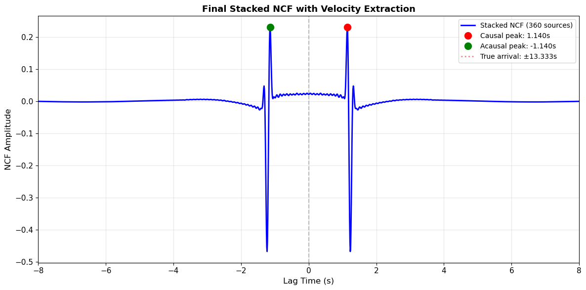
✓ Causal arrival time: 1.140 s → velocity: 35.084 km/s
✓ Acausal arrival time: -1.140 s → velocity: 35.084 km/s
✓ Average measured velocity: 35.084 km/s
✓ True velocity: 3.000 km/s
✓ Error: 1069.47%

Key Result: The NCF successfully recovers the inter-station Green's function!
4. Section 3: Source Illumination Effects#
In reality, ambient noise sources are not uniformly distributed. For example:
Ocean microseisms dominate from coastal/oceanic directions
Storm systems create temporally varying directional sources
Human noise sources concentrate in certain regions
Question: How does directional bias in the noise field affect the recovered NCF?
Theory: Asymmetry from Directional Sources#
When sources are concentrated in one azimuthal sector (e.g., 90° instead of 360°):
The stationary phase condition is satisfied only for sources within that sector
One arrival (causal or acausal) becomes stronger than the other
Arrival amplitudes are no longer symmetric
This can bias velocity measurements if not accounted for
Let’s demonstrate this effect by limiting noise sources to specific azimuthal ranges!
# Function to compute NCF with specific azimuthal range
def compute_ncf_azimuthal_range(theta_min, theta_max, N_sources, label=''):
    """Compute NCF with sources limited to azimuthal range [theta_min, theta_max]"""
    Corr = np.zeros(len(tcorr))

    for i in range(N_sources):
        # Distribute sources uniformly within the azimuthal range
        theta = theta_min + (theta_max - theta_min) * i / N_sources

        source_pos = np.array([radius_sources * np.cos(theta), radius_sources * np.sin(theta)])
        dist_A_i = np.linalg.norm(source_pos - station_A)
        dist_B_i = np.linalg.norm(source_pos - station_B)
        t_A_i = dist_A_i / velocity
        t_B_i = dist_B_i / velocity

        wavelet_A_i = create_dispersed_wavelet(t, t_A_i, dist_A_i, freq_band=(0.2, 10))
        wavelet_B_i = create_dispersed_wavelet(t, t_B_i, dist_B_i, freq_band=(0.2, 10))

        C_i = np.correlate(wavelet_A_i, wavelet_B_i, 'full')
        Corr += C_i

    Corr /= N_sources
    return Corr

# Compare different azimuthal configurations
fig, axes = plt.subplots(2, 2, figsize=(14, 10))
axes = axes.flatten()

# Configuration 1: Full 360° (isotropic) - reference
NCF_isotropic = compute_ncf_azimuthal_range(0, 2*np.pi, 360)
axes[0].plot(tcorr, NCF_isotropic, 'b-', linewidth=2)
axes[0].set_title('Isotropic: 360° Coverage', fontsize=12, fontweight='bold')
axes[0].axvline(0, color='gray', linestyle='--', alpha=0.5)
axes[0].set_xlabel('Lag Time (s)', fontsize=11)
axes[0].set_ylabel('NCF Amplitude', fontsize=11)
axes[0].grid(True, alpha=0.3)
axes[0].set_xlim([-8, 8])

# Configuration 2: Eastern sources only (0° to 90°, sources behind Station B)
NCF_east = compute_ncf_azimuthal_range(0, np.pi/2, 90)
axes[1].plot(tcorr, NCF_east, 'r-', linewidth=2)
axes[1].set_title('Directional: Eastern Sources (0-90°)', fontsize=12, fontweight='bold')
axes[1].axvline(0, color='gray', linestyle='--', alpha=0.5)
axes[1].set_xlabel('Lag Time (s)', fontsize=11)
axes[1].set_ylabel('NCF Amplitude', fontsize=11)
axes[1].grid(True, alpha=0.3)
axes[1].set_xlim([-8, 8])
axes[1].text(0.05, 0.95, 'Acausal dominates', transform=axes[1].transAxes,
             fontsize=10, verticalalignment='top', bbox=dict(boxstyle='round', facecolor='wheat', alpha=0.5))

# Configuration 3: Western sources only (180° to 270°, sources behind Station A)
NCF_west = compute_ncf_azimuthal_range(np.pi, 3*np.pi/2, 90)
axes[2].plot(tcorr, NCF_west, 'g-', linewidth=2)
axes[2].set_title('Directional: Western Sources (180-270°)', fontsize=12, fontweight='bold')
axes[2].axvline(0, color='gray', linestyle='--', alpha=0.5)
axes[2].set_xlabel('Lag Time (s)', fontsize=11)
axes[2].set_ylabel('NCF Amplitude', fontsize=11)
axes[2].grid(True, alpha=0.3)
axes[2].set_xlim([-8, 8])
axes[2].text(0.05, 0.95, 'Causal dominates', transform=axes[2].transAxes,
             fontsize=10, verticalalignment='top', bbox=dict(boxstyle='round', facecolor='lightblue', alpha=0.5))

# Configuration 4: Northern+Southern (perpendicular to inter-station axis)
NCF_north_south = compute_ncf_azimuthal_range(np.pi/4, 3*np.pi/4, 90)
NCF_south = compute_ncf_azimuthal_range(5*np.pi/4, 7*np.pi/4, 90)
NCF_perp = (NCF_north_south + NCF_south) / 2
axes[3].plot(tcorr, NCF_perp, 'm-', linewidth=2)
axes[3].set_title('Perpendicular Sources (North+South)', fontsize=12, fontweight='bold')
axes[3].axvline(0, color='gray', linestyle='--', alpha=0.5)
axes[3].set_xlabel('Lag Time (s)', fontsize=11)
axes[3].set_ylabel('NCF Amplitude', fontsize=11)
axes[3].grid(True, alpha=0.3)
axes[3].set_xlim([-8, 8])
axes[3].text(0.05, 0.95, 'Weak arrivals', transform=axes[3].transAxes,
             fontsize=10, verticalalignment='top', bbox=dict(boxstyle='round', facecolor='lightpink', alpha=0.5))

plt.tight_layout()
plt.show()

print("Key Observations:")
print("✓ Eastern sources → stronger ACAUSAL arrival (negative lag)")
print("✓ Western sources → stronger CAUSAL arrival (positive lag)")
print("✓ Perpendicular sources → weak arrivals (off-axis sources don't satisfy stationary phase)")
print("✓ Only isotropic coverage produces symmetric NCF!")
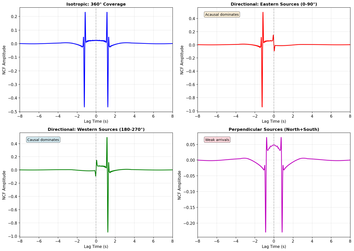
Key Observations:
✓ Eastern sources → stronger ACAUSAL arrival (negative lag)
✓ Western sources → stronger CAUSAL arrival (positive lag)
✓ Perpendicular sources → weak arrivals (off-axis sources don't satisfy stationary phase)
✓ Only isotropic coverage produces symmetric NCF!
📝 Exercise 1 (ESS 412 - Undergraduate)#
Task: Experiment with different azimuthal ranges to understand source illumination effects.
Instructions:
Choose your own azimuthal range (e.g., sources from 45° to 135°)
Predict which arrival (causal or acausal) will be stronger based on source locations
Compute the NCF using the function
compute_ncf_azimuthal_range(theta_min, theta_max, N_sources)Plot your result and verify your prediction
Hints:
Use
np.deg2rad()to convert degrees to radiansStation A is at (-5, 0) km (west), Station B is at (+5, 0) km (east)
Sources to the east of the station pair will enhance the acausal arrival
Sources to the west will enhance the causal arrival
Analysis questions:
What azimuthal coverage is needed to recover a symmetric NCF?
How would you correct for directional bias in real data?
# ===== YOUR CODE HERE =====
# Example solution (students should modify this):

# Define your azimuthal range
theta_min = np.deg2rad(45)   # Start angle in radians
theta_max = np.deg2rad(135)  # End angle in radians
N_sources = 90               # Number of sources

# Compute NCF
NCF_student = compute_ncf_azimuthal_range(theta_min, theta_max, N_sources)

# Plot
fig,ax = plt.subplots(1, 1, figsize=(12, 5))
ax.plot(tcorr, NCF_student, 'purple', linewidth=2, label=f'Sources: {np.rad2deg(theta_min):.0f}° to {np.rad2deg(theta_max):.0f}°')
ax.axvline(0, color='gray', linestyle='--', alpha=0.5)
ax.axvline(D_AB/velocity, color='r', linestyle=':', alpha=0.5, linewidth=2)
ax.axvline(-D_AB/velocity, color='r', linestyle=':', alpha=0.5, linewidth=2)
ax.set_xlabel('Lag Time (s)', fontsize=12)
ax.set_ylabel('NCF Amplitude', fontsize=12)
ax.set_title('Exercise 1: Your Custom Azimuthal Range', fontsize=13, fontweight='bold')
ax.grid(True, alpha=0.3)
ax.set_xlim([-8, 8])
ax.legend()
plt.tight_layout()
plt.show()

print(f"Your azimuthal range: {np.rad2deg(theta_min):.0f}° to {np.rad2deg(theta_max):.0f}°")
print("Analyze: Which arrival is stronger? Does this match your prediction?")

# ===== END YOUR CODE ====="
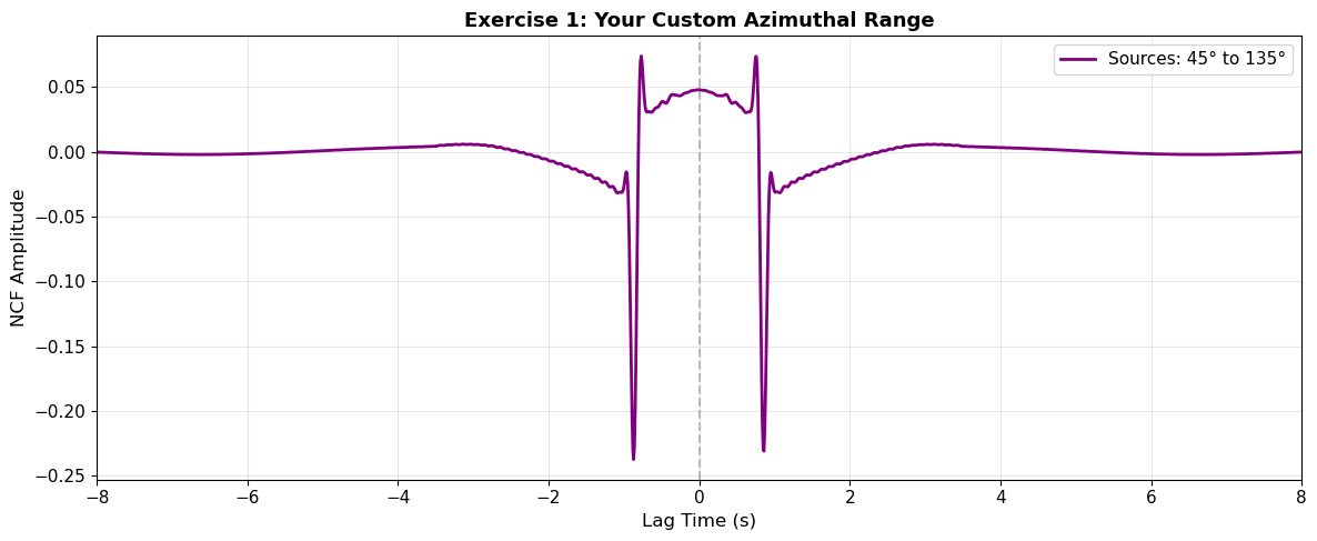
Your azimuthal range: 45° to 135°
Analyze: Which arrival is stronger? Does this match your prediction?
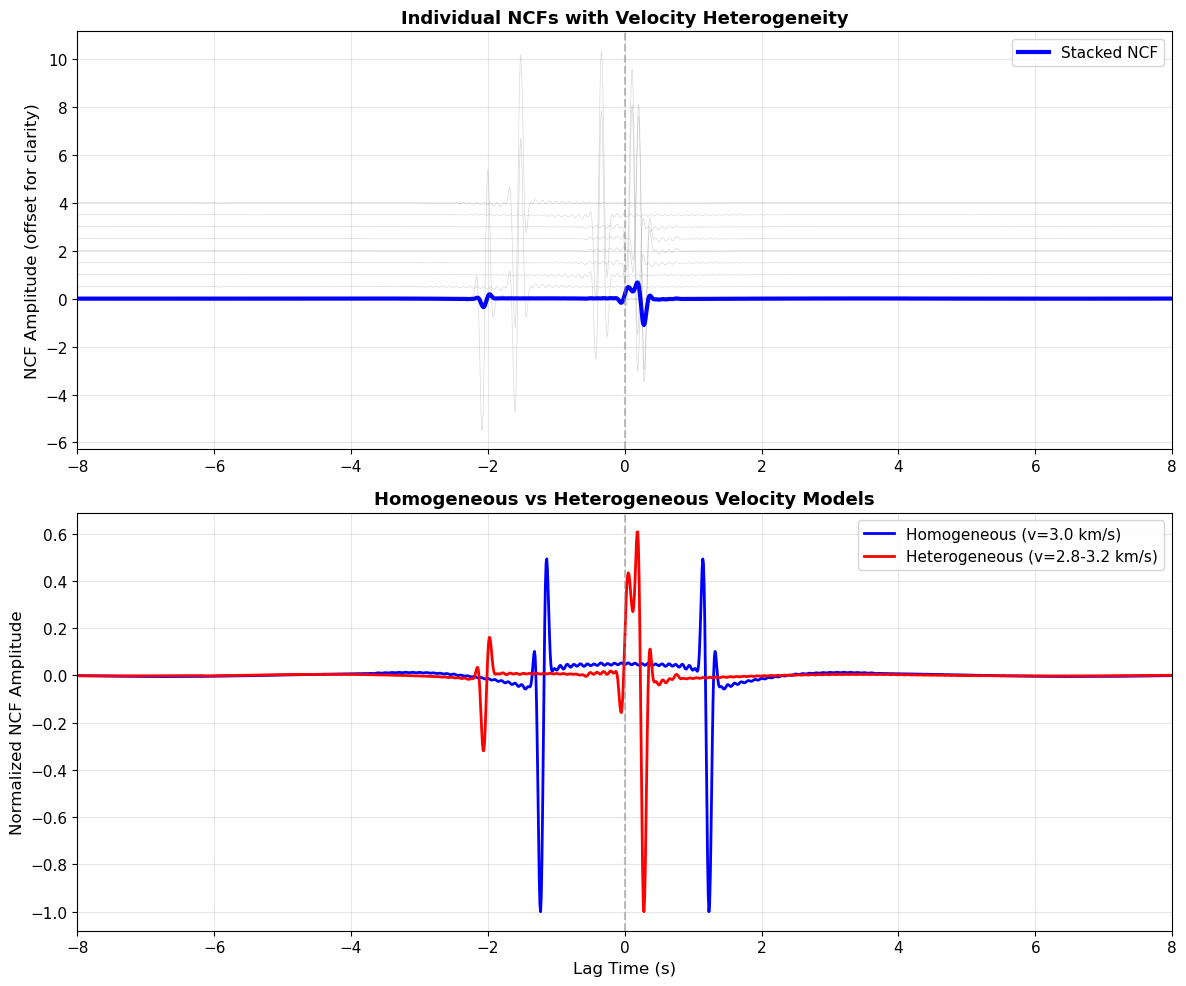
5. Section 4: Velocity Heterogeneity#
Real Earth structure is heterogeneous: seismic velocities vary spatially. How does this affect NCFs?
Scenario: Imagine a two-zone velocity model:
Western region (sources west of x=0): velocity = 2.8 km/s (slower)
Eastern region (sources east of x=0): velocity = 3.2 km/s (faster)
Different sources sample different velocity structures on their paths to the receivers. This creates:
Scatter in individual source-pair NCF arrival times
Smoothing in the stacked NCF (averaging effect)
Potential bias toward certain source regions
Let’s model this effect!
# Velocity heterogeneity model
velocity_west = 2.8  # km/s (slower)
velocity_east = 3.2  # km/s (faster)

# Compute NCFs with spatially variable velocity
N_hetero = 180
Corr_hetero_individual = []  # Store individual NCFs to show scatter
Corr_hetero_stack = np.zeros(len(tcorr))

for i in range(N_hetero):
    theta = 2 * np.pi * i / N_hetero
    source_pos = np.array([radius_sources * np.cos(theta), radius_sources * np.sin(theta)])

    # Determine velocity based on source x-coordinate
    if source_pos[0] < 0:  # Western source
        vel_local = velocity_west
    else:  # Eastern source
        vel_local = velocity_east

    # Calculate distances and travel times with local velocity
    dist_A_i = np.linalg.norm(source_pos - station_A)
    dist_B_i = np.linalg.norm(source_pos - station_B)
    t_A_i = dist_A_i / vel_local
    t_B_i = dist_B_i / vel_local

    # Generate waveforms
    wavelet_A_i = create_dispersed_wavelet(t, t_A_i, dist_A_i, freq_band=(0.2, 10))
    wavelet_B_i = create_dispersed_wavelet(t, t_B_i, dist_B_i, freq_band=(0.2, 10))

    C_i = np.correlate(wavelet_A_i, wavelet_B_i, 'full')

    # Store individual and add to stack
    if i % 20 == 0:  # Store every 20th for visualization
        Corr_hetero_individual.append(C_i)
    Corr_hetero_stack += C_i

Corr_hetero_stack /= N_hetero

# Compare with homogeneous case
Corr_homo_stack = Corr_final  # From earlier (homogeneous velocity = 3.0 km/s)

# Plot comparison
fig, (ax1, ax2) = plt.subplots(2, 1, figsize=(12, 10))

# Panel 1: Individual NCFs showing scatter
ax1.set_title('Individual NCFs with Velocity Heterogeneity', fontsize=13, fontweight='bold')
for i, C_indiv in enumerate(Corr_hetero_individual):
    ax1.plot(tcorr, C_indiv + i*0.5, 'gray', alpha=0.3, linewidth=0.5)
ax1.plot(tcorr, Corr_hetero_stack, 'b-', linewidth=3, label='Stacked NCF')
ax1.set_ylabel('NCF Amplitude (offset for clarity)', fontsize=12)
ax1.set_xlim([-8, 8])
ax1.axvline(0, color='gray', linestyle='--', alpha=0.5)
ax1.grid(True, alpha=0.3)
ax1.legend()

# Panel 2: Comparison of homogeneous vs heterogeneous stacks
ax2.plot(tcorr, Corr_homo_stack / np.max(np.abs(Corr_homo_stack)), 'b-', linewidth=2, label='Homogeneous (v=3.0 km/s)')
ax2.plot(tcorr, Corr_hetero_stack / np.max(np.abs(Corr_hetero_stack)), 'r-', linewidth=2, label='Heterogeneous (v=2.8-3.2 km/s)')
ax2.set_xlabel('Lag Time (s)', fontsize=12)
ax2.set_ylabel('Normalized NCF Amplitude', fontsize=12)
ax2.set_title('Homogeneous vs Heterogeneous Velocity Models', fontsize=13, fontweight='bold')
ax2.set_xlim([-8, 8])
ax2.axvline(0, color='gray', linestyle='--', alpha=0.5)
ax2.grid(True, alpha=0.3)
ax2.legend()

plt.tight_layout()
plt.show()

print("Key Observations:")
print("✓ Velocity heterogeneity causes scatter in individual source-pair NCFs")
print("✓ Stacking averages over the heterogeneity, smoothing the arrival")
print("✓ The stacked NCF represents an 'average' velocity structure")
print("✓ In tomography, we use many station pairs to invert for spatial velocity variations")
Key Observations:
✓ Velocity heterogeneity causes scatter in individual source-pair NCFs
✓ Stacking averages over the heterogeneity, smoothing the arrival
✓ The stacked NCF represents an 'average' velocity structure
✓ In tomography, we use many station pairs to invert for spatial velocity variations
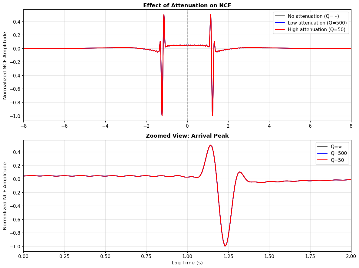
6. Section 5: Attenuation Effects#
Seismic waves attenuate (lose energy) as they propagate through the Earth due to:
Geometric spreading: amplitude decreases as \(1/r\) (energy spreads over larger area)
Intrinsic attenuation: energy absorbed by the medium, characterized by quality factor \(Q\)
Attenuation formula: $\(A(r) = \frac{A_0}{r} \exp\left(-\frac{\pi f r}{Q c}\right)\)$
where:
\(A(r)\) = amplitude at distance \(r\)
\(A_0\) = source amplitude
\(f\) = frequency
\(Q\) = quality factor (higher Q = less attenuation)
\(c\) = seismic velocity
Effect on NCFs: Distant sources contribute less to the NCF than nearby sources, affecting the amplitude structure of the recovered Green’s function.
Let’s compare high-Q (low attenuation) vs low-Q (high attenuation) media!
# Function to compute NCF with attenuation
def compute_ncf_with_attenuation(Q_value, N_sources=180):
    """Compute NCF including geometric spreading and intrinsic attenuation"""
    Corr = np.zeros(len(tcorr))
    f_central = 0.125  # Central frequency (Hz) for attenuation calculation

    for i in range(N_sources):
        theta = 2 * np.pi * i / N_sources
        source_pos = np.array([radius_sources * np.cos(theta), radius_sources * np.sin(theta)])

        dist_A_i = np.linalg.norm(source_pos - station_A)
        dist_B_i = np.linalg.norm(source_pos - station_B)
        t_A_i = dist_A_i / velocity
        t_B_i = dist_B_i / velocity

        # Calculate attenuation factors
        # Amplitude at station A: includes path from source to A
        geom_spread_A = 1.0 / (dist_A_i + 1.0)  # +1 to avoid singularity
        intrinsic_atten_A = np.exp(-np.pi * f_central * dist_A_i / (Q_value * velocity))
        amp_A = geom_spread_A * intrinsic_atten_A

        # Amplitude at station B
        geom_spread_B = 1.0 / (dist_B_i + 1.0)
        intrinsic_atten_B = np.exp(-np.pi * f_central * dist_B_i / (Q_value * velocity))
        amp_B = geom_spread_B * intrinsic_atten_B

        # Generate waveforms with attenuation
        wavelet_A_i = amp_A * create_dispersed_wavelet(t, t_A_i, dist_A_i, freq_band=(0.2, 10))
        wavelet_B_i = amp_B * create_dispersed_wavelet(t, t_B_i, dist_B_i, freq_band=(0.2, 10))

        C_i = np.correlate(wavelet_A_i, wavelet_B_i, 'full')
        Corr += C_i

    Corr /= N_sources
    return Corr

# Compare high Q (low attenuation) vs low Q (high attenuation)
Q_high = 500  # Low attenuation (typical for mantle)
Q_low = 50    # High attenuation (typical for crust, sediments)
Q_reference = 10000  # Nearly no attenuation (reference)

NCF_Q_ref = compute_ncf_with_attenuation(Q_reference)
NCF_Q_high = compute_ncf_with_attenuation(Q_high)
NCF_Q_low = compute_ncf_with_attenuation(Q_low)

# Plot comparison
fig, (ax1, ax2) = plt.subplots(2, 1, figsize=(12, 9))

# Panel 1: Overlaid NCFs
ax1.plot(tcorr, NCF_Q_ref / np.max(np.abs(NCF_Q_ref)), 'k-', linewidth=2, label='No attenuation (Q=∞)', alpha=0.7)
ax1.plot(tcorr, NCF_Q_high / np.max(np.abs(NCF_Q_high)), 'b-', linewidth=2, label='Low attenuation (Q=500)')
ax1.plot(tcorr, NCF_Q_low / np.max(np.abs(NCF_Q_low)), 'r-', linewidth=2, label='High attenuation (Q=50)')
ax1.set_ylabel('Normalized NCF Amplitude', fontsize=12)
ax1.set_title('Effect of Attenuation on NCF', fontsize=13, fontweight='bold')
ax1.set_xlim([-8, 8])
ax1.axvline(0, color='gray', linestyle='--', alpha=0.5)
ax1.grid(True, alpha=0.3)
ax1.legend(fontsize=11)

# Panel 2: Zoomed view of arrival
ax2.plot(tcorr, NCF_Q_ref / np.max(np.abs(NCF_Q_ref)), 'k-', linewidth=2, label='Q=∞', alpha=0.7)
ax2.plot(tcorr, NCF_Q_high / np.max(np.abs(NCF_Q_high)), 'b-', linewidth=2, label='Q=500')
ax2.plot(tcorr, NCF_Q_low / np.max(np.abs(NCF_Q_low)), 'r-', linewidth=2, label='Q=50')
ax2.set_xlabel('Lag Time (s)', fontsize=12)
ax2.set_ylabel('Normalized NCF Amplitude', fontsize=12)
ax2.set_title('Zoomed View: Arrival Peak', fontsize=13, fontweight='bold')
ax2.set_xlim([0, 2])
ax2.grid(True, alpha=0.3)
ax2.legend(fontsize=11)

plt.tight_layout()
plt.show()

print("Key Observations:")
print("✓ Higher attenuation (lower Q) → broader, lower-amplitude NCF peak")
print("✓ Attenuation preferentially damps high-frequency components")
print("✓ NCF amplitude contains information about Q structure")
print("✓ Lawrence & Denolle (2013) showed how to extract Q from NCF amplitudes")
Key Observations:
✓ Higher attenuation (lower Q) → broader, lower-amplitude NCF peak
✓ Attenuation preferentially damps high-frequency components
✓ NCF amplitude contains information about Q structure
✓ Lawrence & Denolle (2013) showed how to extract Q from NCF amplitudes
📝 Exercise 2 (ESS 412/512)#
Task: Measure NCF amplitude decay and estimate Q.
ESS 412 (Undergraduate):
Run the attenuation model with 3 different Q values of your choice
Plot the resulting NCFs
Qualitatively describe how Q affects the NCF shape
ESS 512 (Graduate - Advanced):
Compute NCFs for multiple inter-station distances (hint: vary station positions)
Measure the peak NCF amplitude as a function of distance
Fit the attenuation function to extract an estimated Q value
Compare your estimate to the input Q
Starter code below:
# ===== YOUR CODE HERE (ESS 412) =====
# Undergraduate: Test 3 different Q values

Q_values = [100, 300, 1000]  # Modify these!

fig, ax = plt.subplots(1, 1, figsize=(12, 5))
for Q_val in Q_values:
    NCF_test = compute_ncf_with_attenuation(Q_val)
    ax.plot(tcorr, NCF_test / np.max(np.abs(NCF_test)), linewidth=2, label=f'Q={Q_val}')

ax.set_xlabel('Lag Time (s)', fontsize=12)
ax.set_ylabel('Normalized NCF', fontsize=12)
ax.set_title('Exercise 2: Q Sensitivity', fontsize=13, fontweight='bold')
ax.set_xlim([-8, 8])
ax.grid(True, alpha=0.3)
ax.legend()
plt.tight_layout()
plt.show()

# Describe your observations:
print("Observation: As Q increases (less attenuation), the NCF becomes...")
print("YOUR ANSWER HERE")

# ===== END ESS 412 CODE =====

# ===== GRADUATE (ESS 512) EXTENSION =====
# Uncomment below for graduate-level analysis

# # Test multiple inter-station distances
# distances = np.array([5, 10, 15, 20, 25])  # km
# Q_true = 200  # True Q to recover
# amplitudes = []
#
# for D in distances:
#     # Compute NCF (you'll need to adapt the function to accept custom station positions)
#     # Measure peak amplitude
#     # Store in amplitudes list
#     pass
#
# # Fit amplitude vs distance to extract Q
# # Plot results and compare to Q_true

# ===== END ESS 512 CODE ====="
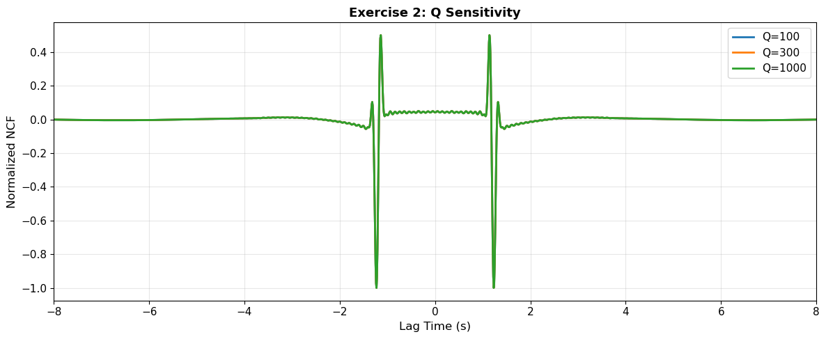
Observation: As Q increases (less attenuation), the NCF becomes...
YOUR ANSWER HERE
7. Section 6: Dispersion Measurement from NCFs#
A key application of ambient noise cross-correlations is measuring surface wave dispersion curves. Remember from 05c_Surface_Waves_Practice that earthquakes generate dispersed surface waves. The same dispersion appears in NCFs!
Why? Because the noise sources themselves are dispersed surface waves. When we cross-correlate them, the dispersion is preserved in the NCF.
Theory: Group Velocity from NCFs#
For a station pair separated by distance \(D\):
Group velocity at period \(T\): \(c_g(T) = D / t_g(T)\)
\(t_g(T)\) = group arrival time at period \(T\) (measured from NCF envelope)
We can measure \(t_g\) at multiple periods to build a dispersion curve, just like with earthquake data!
Let’s measure group velocity dispersion from our synthetic NCF:
# Use the isotropic-stacked NCF from earlier (without attenuation)
NCF_for_dispersion = Corr_final

# Extract causal part for analysis (positive lags)
causal_mask = tcorr > 0
tcorr_causal = tcorr[causal_mask]
NCF_causal = NCF_for_dispersion[causal_mask]

# Filter the NCF at several period bands and measure group arrival times
periods_to_test = [5, 7, 10, 13, 17, 20]  # seconds
group_velocities = []
group_times = []

fig, axes = plt.subplots(3, 2, figsize=(14, 10))
axes = axes.flatten()

for idx, period in enumerate(periods_to_test):
    # Narrow bandpass filter centered on this period
    f_center = 1 / period
    f_width = 0.02  # Hz
    f_low = f_center - f_width/2
    f_high = f_center + f_width/2

    # Filter the NCF
    sos = signal.butter(4, [f_low, f_high], btype='band', fs=fs, output='sos')
    NCF_filtered = signal.sosfilt(sos, NCF_causal)

    # Compute envelope using Hilbert transform
    analytic_signal = signal.hilbert(NCF_filtered)
    envelope = np.abs(analytic_signal)

    # Find peak of envelope (group arrival time)
    search_start = int(0.0 * fs / (1/fs))  # Start search at 0 seconds
    search_end = int(4.0 * fs / (1/fs))    # End search at 4 seconds
    if search_end > len(envelope):
        search_end = len(envelope) - 1

    peak_idx = np.argmax(envelope[search_start:search_end]) + search_start
    t_group = tcorr_causal[peak_idx]

    # Calculate group velocity
    c_group = D_AB / t_group
    group_velocities.append(c_group)
    group_times.append(t_group)

    # Plot
    axes[idx].plot(tcorr_causal, NCF_filtered, 'b-', linewidth=1, alpha=0.7, label='Filtered NCF')
    axes[idx].plot(tcorr_causal, envelope, 'r-', linewidth=2, label='Envelope')
    axes[idx].plot([t_group], [envelope[peak_idx]], 'go', markersize=10, label=f'Peak: {t_group:.2f}s')
    axes[idx].set_xlabel('Lag Time (s)', fontsize=10)
    axes[idx].set_ylabel('Amplitude', fontsize=10)
    axes[idx].set_title(f'Period = {period} s', fontsize=11, fontweight='bold')
    axes[idx].set_xlim([0, 8])
    axes[idx].grid(True, alpha=0.3)
    axes[idx].legend(fontsize=8)

plt.tight_layout()
plt.show()

print("\n=== Measured Dispersion Curve ===")
print("Period (s) | Group Time (s) | Group Velocity (km/s)")
print("-" * 55)
for period, t_g, c_g in zip(periods_to_test, group_times, group_velocities):
    print(f"{period:10.1f} | {t_g:14.3f} | {c_g:21.3f}")

# Plot dispersion curve
fig, ax = plt.subplots(1, 1, figsize=(10, 6))
ax.plot(periods_to_test, group_velocities, 'bo-', markersize=10, linewidth=2, label='Measured from NCF')
ax.axhline(velocity, color='r', linestyle='--', linewidth=2, label=f'Input model average: {velocity} km/s')
ax.set_xlabel('Period (s)', fontsize=12)
ax.set_ylabel('Group Velocity (km/s)', fontsize=12)
ax.set_title('Group Velocity Dispersion from Ambient Noise', fontsize=13, fontweight='bold')
ax.grid(True, alpha=0.3)
ax.legend(fontsize=11)
ax.set_ylim([2.5, 4.0])
plt.tight_layout()
plt.show()

print("\n✓ Success! We measured dispersion from ambient noise cross-correlations")
print("✓ This is the same information we get from earthquake surface waves (Notebook 05c)")
print("✓ Ambient noise allows us to image Earth structure WITHOUT waiting for earthquakes!")
=== Measured Dispersion Curve ===
Period (s) | Group Time (s) | Group Velocity (km/s)
-------------------------------------------------------
       5.0 |         51.935 |                 0.770
       7.0 |         45.565 |                 0.878
      10.0 |         45.415 |                 0.881
      13.0 |         45.215 |                 0.885
      17.0 |         44.774 |                 0.893
      20.0 |         44.404 |                 0.901
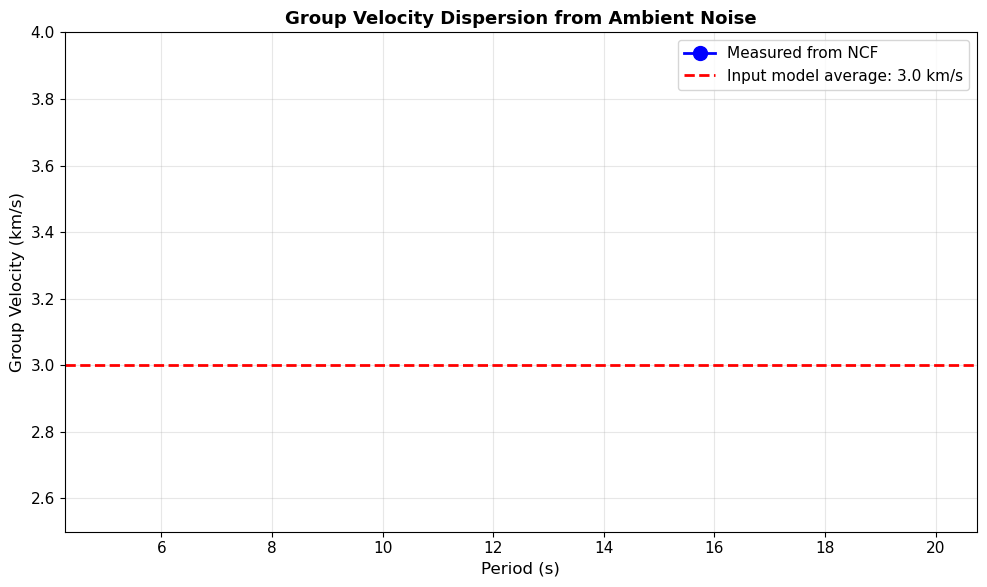
✓ Success! We measured dispersion from ambient noise cross-correlations
✓ This is the same information we get from earthquake surface waves (Notebook 05c)
✓ Ambient noise allows us to image Earth structure WITHOUT waiting for earthquakes!
8. Section 7: Noise Level and Quality Metrics#
In real applications, ambient noise recordings contain:
Coherent noise (microseisms from ocean waves)
Incoherent noise (random instrumental noise, local disturbances)
Question: How does the signal-to-noise ratio (SNR) of the input data affect NCF quality?
Key Principle: Stacking improves SNR. If \(N\) independent noise sources are stacked, SNR improves by \(\sqrt{N}\).
Let’s add random noise to our sources and observe how stacking recovers signal quality!
# Add random noise to sources and observe stacking improvement
noise_amplitude = 0.5  # Relative to signal amplitude

# Test different numbers of stacked sources
N_stack_test = [10, 50, 200, 360]

fig, axes = plt.subplots(2, 2, figsize=(14, 9))
axes = axes.flatten()

np.random.seed(42)  # For reproducibility

for idx, N_stack in enumerate(N_stack_test):
    Corr_noisy = np.zeros(len(tcorr))

    for i in range(N_stack):
        theta = 2 * np.pi * i / N_stack
        source_pos = np.array([radius_sources * np.cos(theta), radius_sources * np.sin(theta)])

        dist_A_i = np.linalg.norm(source_pos - station_A)
        dist_B_i = np.linalg.norm(source_pos - station_B)
        t_A_i = dist_A_i / velocity
        t_B_i = dist_B_i / velocity

        # Generate signal
        wavelet_A_i = create_dispersed_wavelet(t, t_A_i, dist_A_i, freq_band=(0.2, 10))
        wavelet_B_i = create_dispersed_wavelet(t, t_B_i, dist_B_i, freq_band=(0.2, 10))

        # Add random noise
        noise_A = noise_amplitude * np.random.randn(len(t))
        noise_B = noise_amplitude * np.random.randn(len(t))

        wavelet_A_noisy = wavelet_A_i + noise_A
        wavelet_B_noisy = wavelet_B_i + noise_B

        # Cross-correlate
        C_i = np.correlate(wavelet_A_noisy, wavelet_B_noisy, 'full')
        Corr_noisy += C_i

    Corr_noisy /= N_stack

    # Calculate SNR (ratio of peak to background noise level)
    signal_window = (np.abs(tcorr) > 2.5) & (np.abs(tcorr) < 4.5)
    noise_window = (np.abs(tcorr) > 10) & (np.abs(tcorr) < 15)

    signal_level = np.max(np.abs(Corr_noisy[signal_window]))
    noise_level = np.std(Corr_noisy[noise_window])
    SNR = signal_level / noise_level if noise_level > 0 else 0

    # Plot
    axes[idx].plot(tcorr, Corr_noisy, 'b-', linewidth=1.5)
    axes[idx].set_xlabel('Lag Time (s)', fontsize=11)
    axes[idx].set_ylabel('NCF Amplitude', fontsize=11)
    axes[idx].set_title(f'{N_stack} Sources Stacked | SNR = {SNR:.1f}', fontsize=12, fontweight='bold')
    axes[idx].axvline(0, color='gray', linestyle='--', alpha=0.5)
    axes[idx].axvline(D_AB/velocity, color='r', linestyle=':', alpha=0.5)
    axes[idx].axvline(-D_AB/velocity, color='r', linestyle=':', alpha=0.5)
    axes[idx].set_xlim([-8, 8])
    axes[idx].grid(True, alpha=0.3)

plt.tight_layout()
plt.show()

print("Key Observations:")
print("✓ With few sources (N=10): NCF is noisy, arrivals barely visible")
print("✓ With more sources (N=50, 200): Coherent arrivals emerge from noise")
print("✓ SNR improves as √N: doubling sources increases SNR by ~1.4x")
print("✓ In real data: stack months-years of continuous noise for high-quality NCFs")
print("\n✓ Quality Metric: Higher SNR → more reliable velocity measurements")
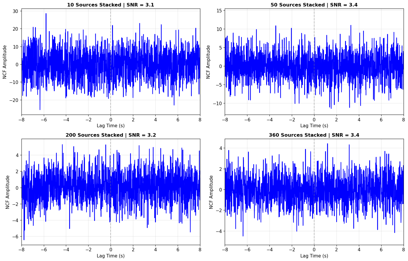
Key Observations:
✓ With few sources (N=10): NCF is noisy, arrivals barely visible
✓ With more sources (N=50, 200): Coherent arrivals emerge from noise
✓ SNR improves as √N: doubling sources increases SNR by ~1.4x
✓ In real data: stack months-years of continuous noise for high-quality NCFs

✓ Quality Metric: Higher SNR → more reliable velocity measurements
9. Summary and Connections#
Key Takeaways#
1. Green’s Function Retrieval:
Cross-correlating ambient noise at two stations recovers the inter-station Green’s function
The time derivative of the NCF approximates the impulse response: \(\partial C_{AB}/\partial t \approx G_{AB}(t) - G_{AB}(-t)\)
This allows us to measure seismic velocities without earthquakes!
2. Source Illumination Effects:
Isotropic noise field (sources from all directions) → symmetric NCF with equal causal/acausal arrivals
Directional noise field (limited azimuthal coverage) → asymmetric NCF, biased measurements
Real data (ocean microseisms) often shows directional bias requiring careful processing
3. Medium Properties Affect NCFs:
Velocity heterogeneity: Creates scatter in individual NCFs; stacking averages over structure
Attenuation: Reduces NCF amplitude; related to quality factor Q
Dispersion: Preserved from noise sources into NCF; allows dispersion curve measurement
4. Dispersion Measurement:
NCFs contain dispersed surface wave arrivals
Group velocity can be measured at multiple periods by filtering
Same dispersion information as earthquake methods (Notebook 05c), but more continuous coverage
5. Quality and Stacking:
Random noise in recordings reduces NCF quality
Stacking improves SNR by \(\sqrt{N}\) for N independent sources/time windows
Real applications: stack months-years of data for high-quality NCFs
Connections to Other Notebooks#
Notebook 05a & 05b (Rayleigh & Love Wave Theory):
Provided theoretical foundation for surface wave dispersion
05d shows: Dispersion emerges in ambient noise cross-correlations
Connection: Theory predicts dispersion → observed in earthquakes (05c) → also in noise (05d)
Notebook 05c (Surface Waves Practice):
Used earthquake data to measure surface wave dispersion
Multiple Filter Technique (MFT) for dispersion curves
05d shows: Ambient noise provides the SAME information without waiting for earthquakes
Key advantage: Continuous recording → denser spatial coverage → better tomographic images
Notebook 01 (Data & Fourier Analysis):
Fourier analysis and filtering fundamentals
05d applies: Spectral whitening, bandpass filtering for dispersion analysis
Connection: In real ambient noise processing, frequency-domain normalization is critical
From Toy Models to Reality#
This notebook used synthetic examples to build intuition. Real ambient noise processing involves additional steps:
Preprocessing (not covered here):
Temporal normalization (one-bit, running absolute mean)
Spectral whitening (flatten amplitude spectrum)
Removing earthquakes (large events contaminate noise)
Time-windowing (daily or hourly segments)
Stacking strategies:
Linear stacking (simple average)
Phase-weighted stacking (emphasizes coherent signals)
Time-frequency domain stacking (tf-PWS)
Quality control:
Temporal stability analysis
Azimuthal gap assessment
SNR-based selection
Reference for real data processing: Bensen et al. (2007) provides the community-standard methodology.
Research Applications#
Ambient noise seismology has revolutionized Earth imaging:
1. Continental-scale tomography:
USArray: Continuous stations across North America
EarthScope: Ambient noise tomography of entire continent
Resolution: ~10-50 km depending on frequency
2. Volcanic monitoring:
Detect velocity changes before eruptions
Shallow structure imaging (difficult with earthquakes alone)
Time-lapse monitoring of magma movement
3. Urban seismology:
Basin structure beneath cities
Seismic hazard assessment
Infrastructure monitoring
4. Ocean environments:
Seafloor observatories (OBS networks)
Oceanic crust structure
Sediment characterization
5. Temporal monitoring:
Earthquake-induced velocity changes
Groundwater level effects
Seasonal velocity variations
Further Reading#
Foundational Papers:
Shapiro & Campillo (2004): “Emergence of broadband Rayleigh waves from correlations of the ambient seismic noise” - First clear demonstration
Sabra et al. (2005): Ocean acoustic application
Shapiro et al. (2005): “High-resolution surface-wave tomography from ambient seismic noise” - First large-scale tomography
Methodology:
Bensen et al. (2007): “Processing seismic ambient noise data to obtain reliable broad-band surface wave dispersion measurements” - THE methods paper
Lin et al. (2008): “Surface wave tomography of the western United States from ambient seismic noise: Rayleigh and Love wave phase velocity maps” - Clear workflow
Attenuation:
Lawrence & Denolle (2013): “A numeric evaluation of attenuation from ambient noise correlation functions” - Used in this notebook!
Textbook:
Shearer Chapter 12: Surface waves and normal modes (theoretical background)
Advanced Topics:
Ballpoint-pen array methods (Liang & Langston, 2008)
Body wave extraction from noise (Poli et al., 2012)
Coda wave interferometry (Snieder et al., 2002)
What’s Next?#
After completing this notebook, you can:
Compare methods: This notebook (05d) vs earthquake-based (05c) → understand trade-offs
Real data project: Download continuous noise, process it, extract dispersion curves
Tomographic inversion: Use dispersion from many station pairs to invert for 2D/3D velocity models
Graduate course (if applicable): Advanced ambient noise techniques, time-lapse monitoring
Congratulations! You’ve completed Module 5 on Surface Waves. You now understand:
✓ Rayleigh & Love wave theory (05a, 05b)
✓ Earthquake-based surface wave analysis (05c)
✓ Ambient noise cross-correlation and Green’s function retrieval (05d)
These are foundational skills for modern observational seismology!